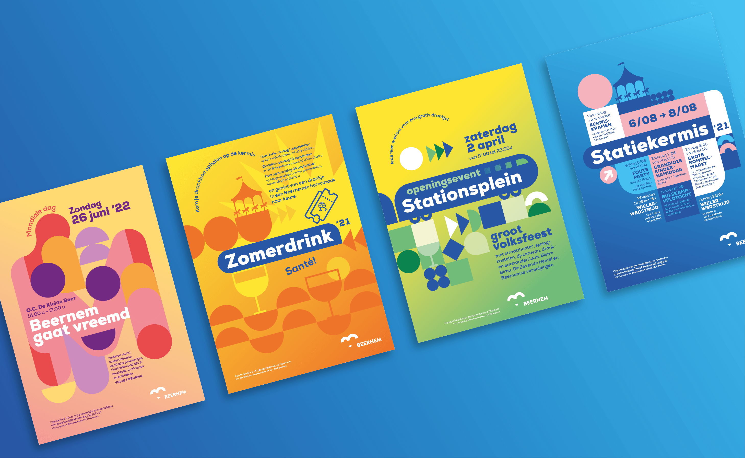
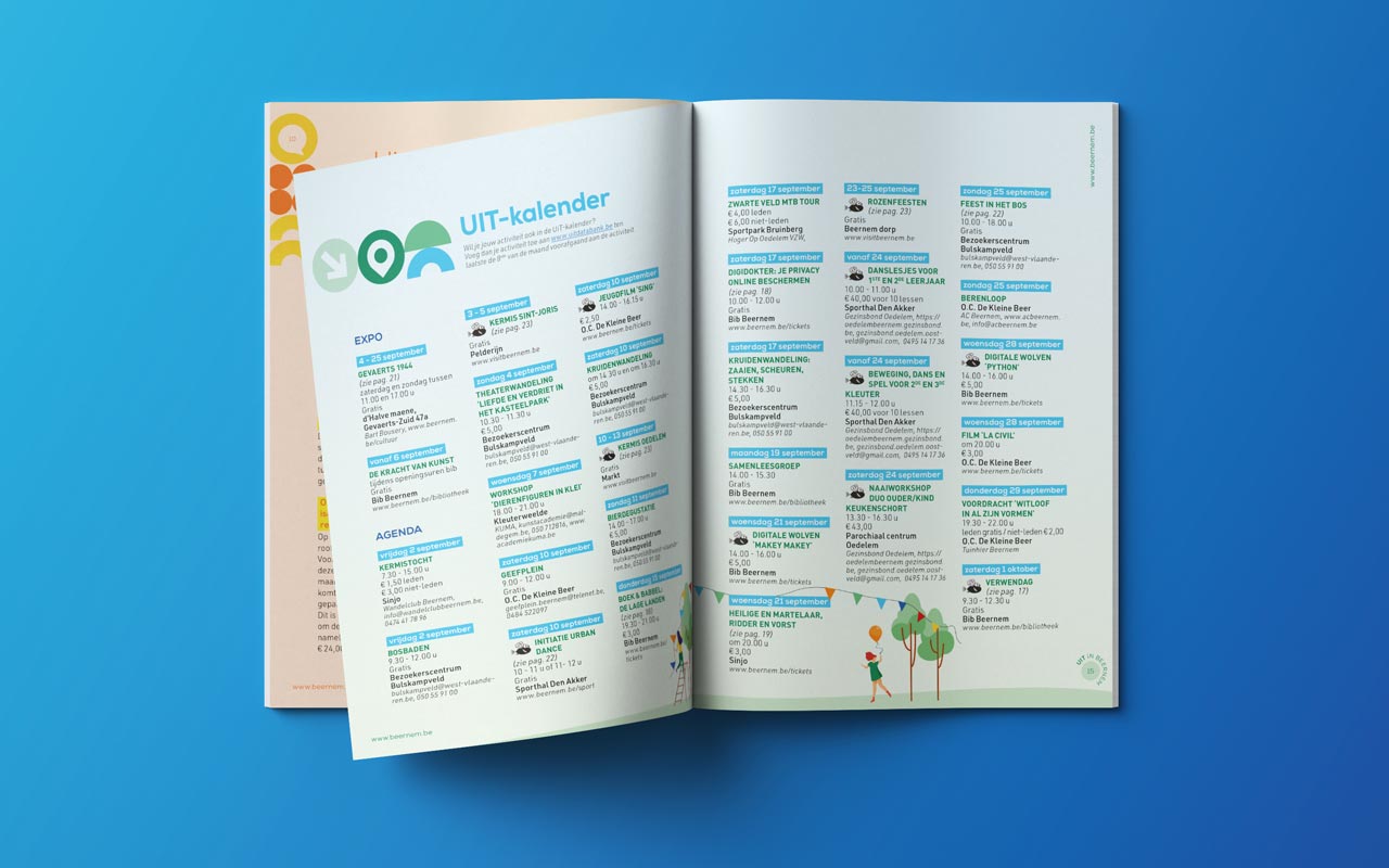
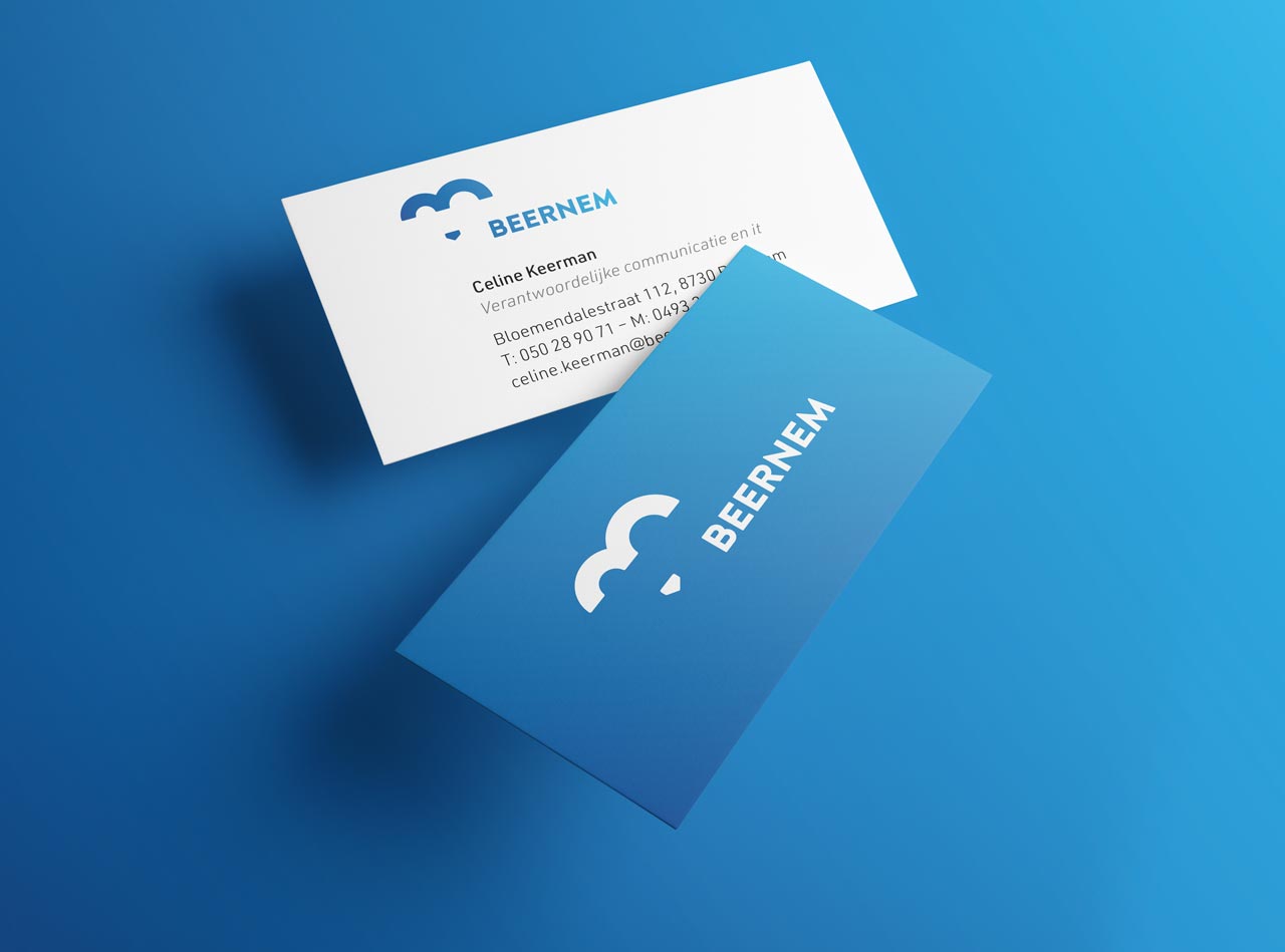
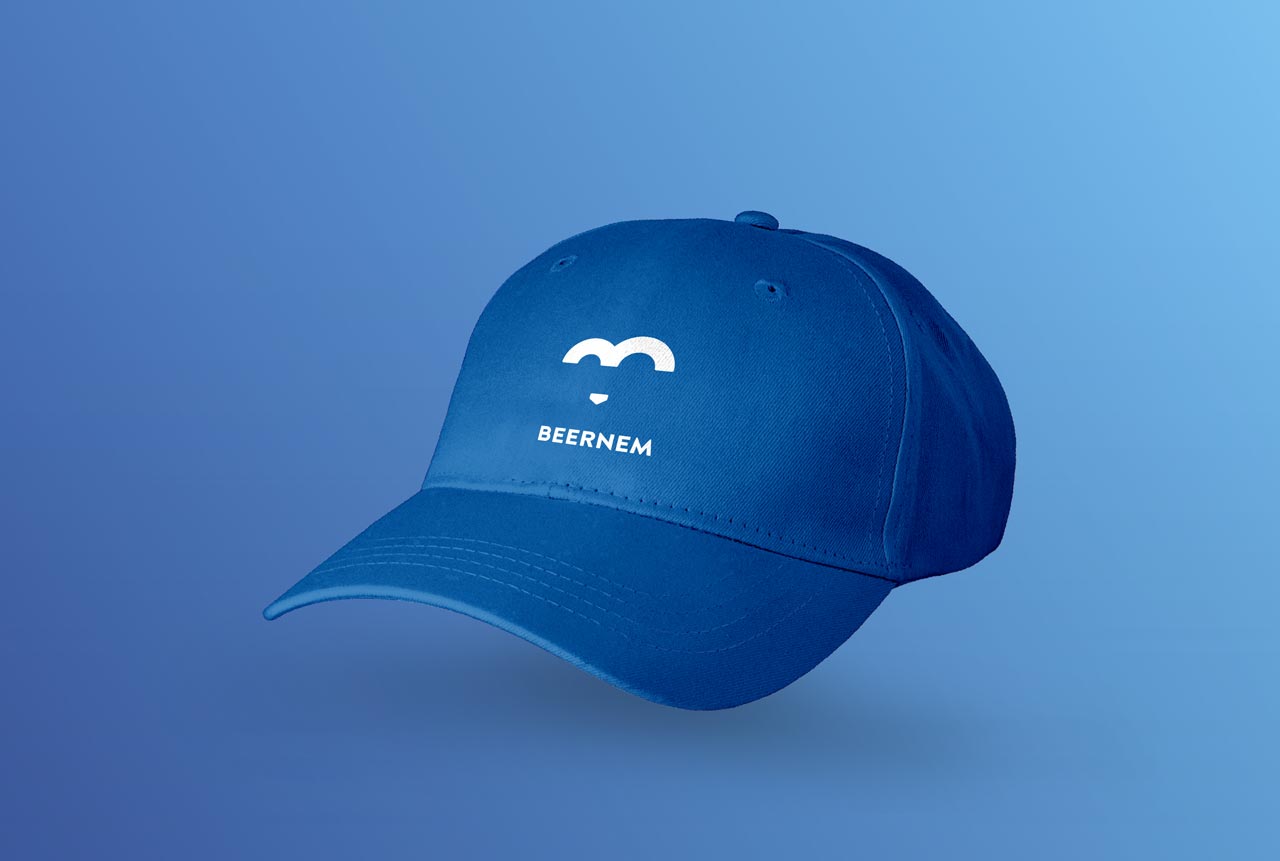
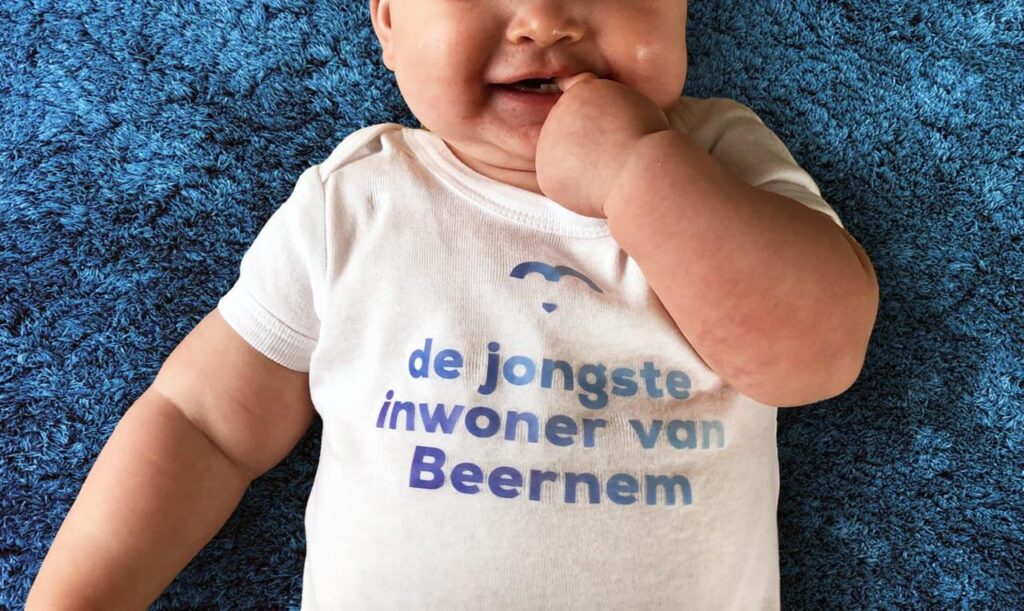
Beernem is a vibrant West Flemish municipality in the green belt around Bruges. The municipal coat of arms has long been used as its logo. To better showcase the municipality and ensure that its initiatives are more recognizable, the need arose for a promotional campaign. logo and own corporate identity.

The B of Beernem, but also of Bears, Bridges, Forests, Farmers, Blossoming, Sparkling, Boosting, Experiencing, Fascinating … Beestig.

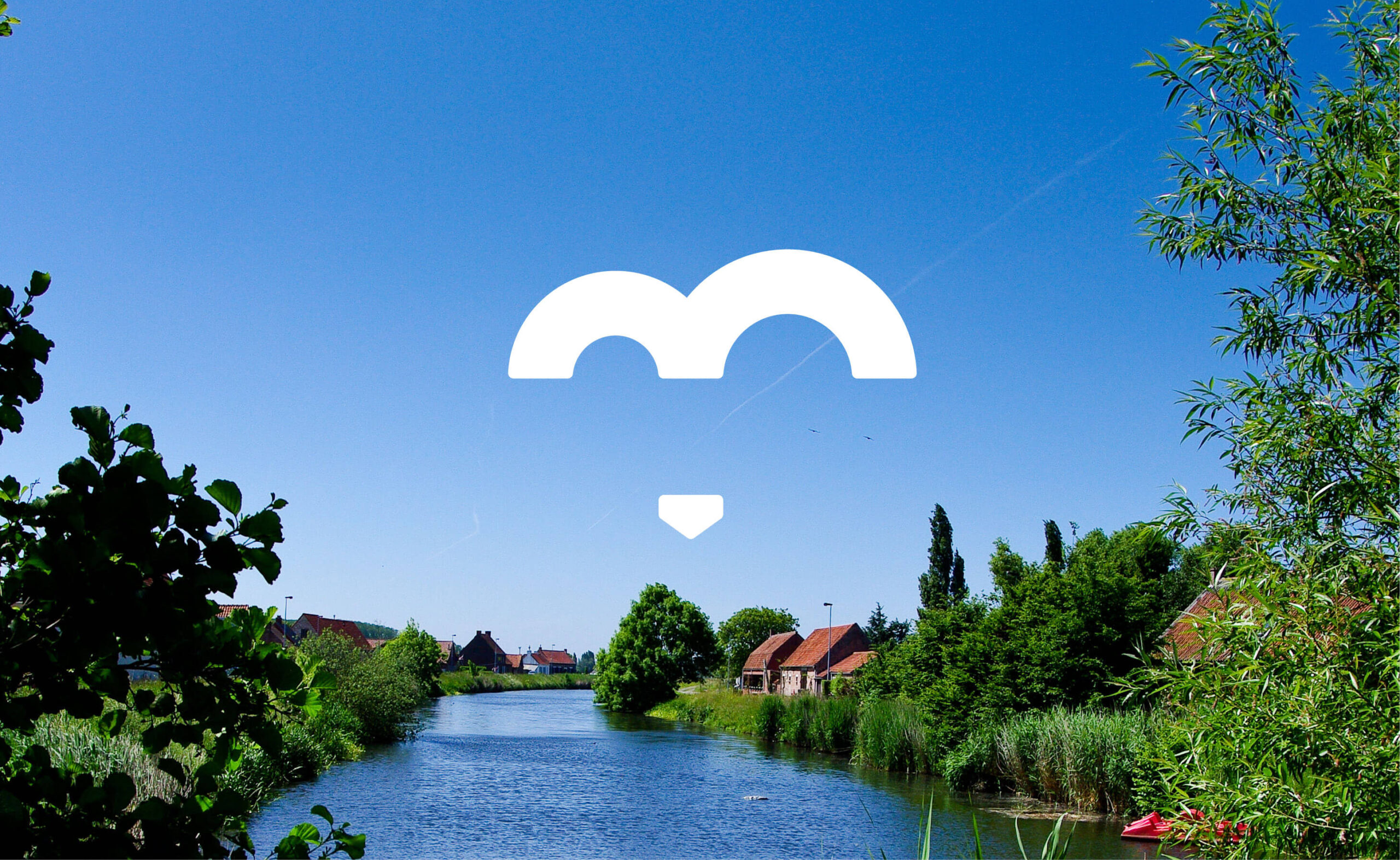
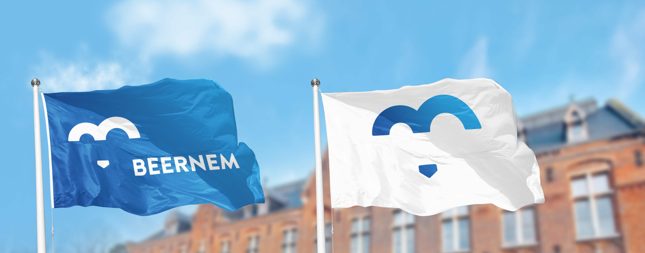
When you think of Beernem, you think of bears. The bear represents Beernem's tradition and historical wealth, warmth and strength.

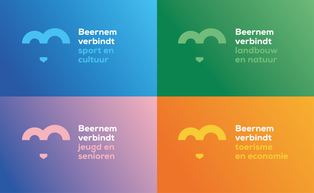
The landscape of Beernem is connected by the many bridges. The 3 pillars of the bridge in the logo symbolize the 3 sub-municipalities: Beernem, Oedelem, Sint-Joris.

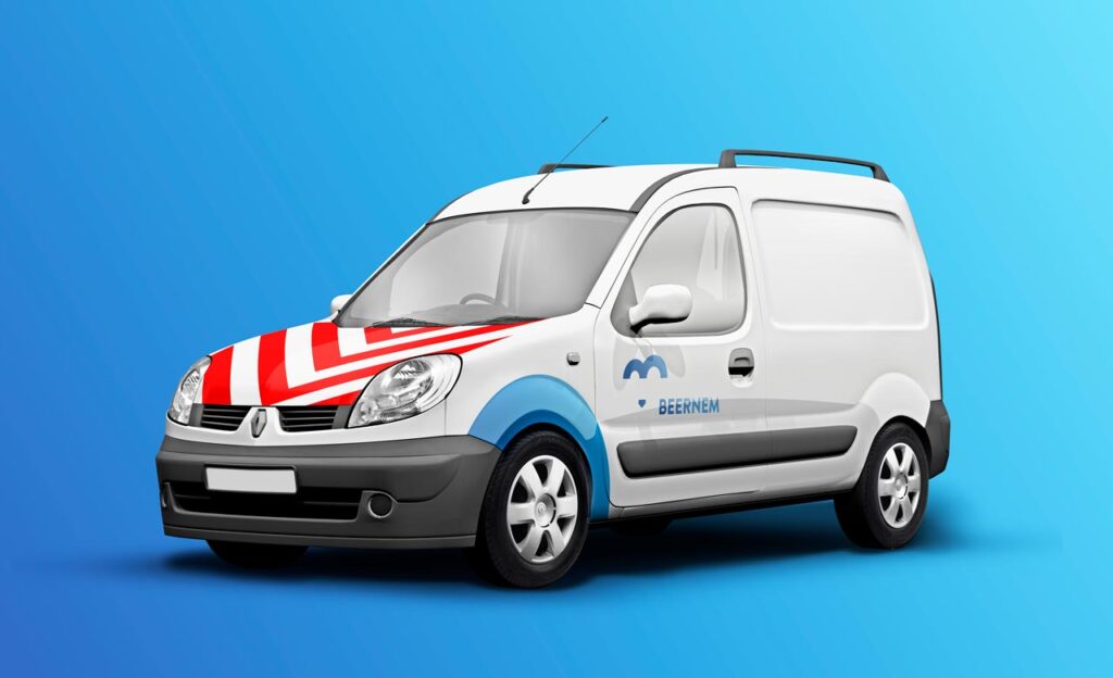
We set Beernem on the map! A strong identity ensures optimal visibility, even beyond the municipal boundaries.
The bear's nose also represents the 4th village core that Beernem is rich in.


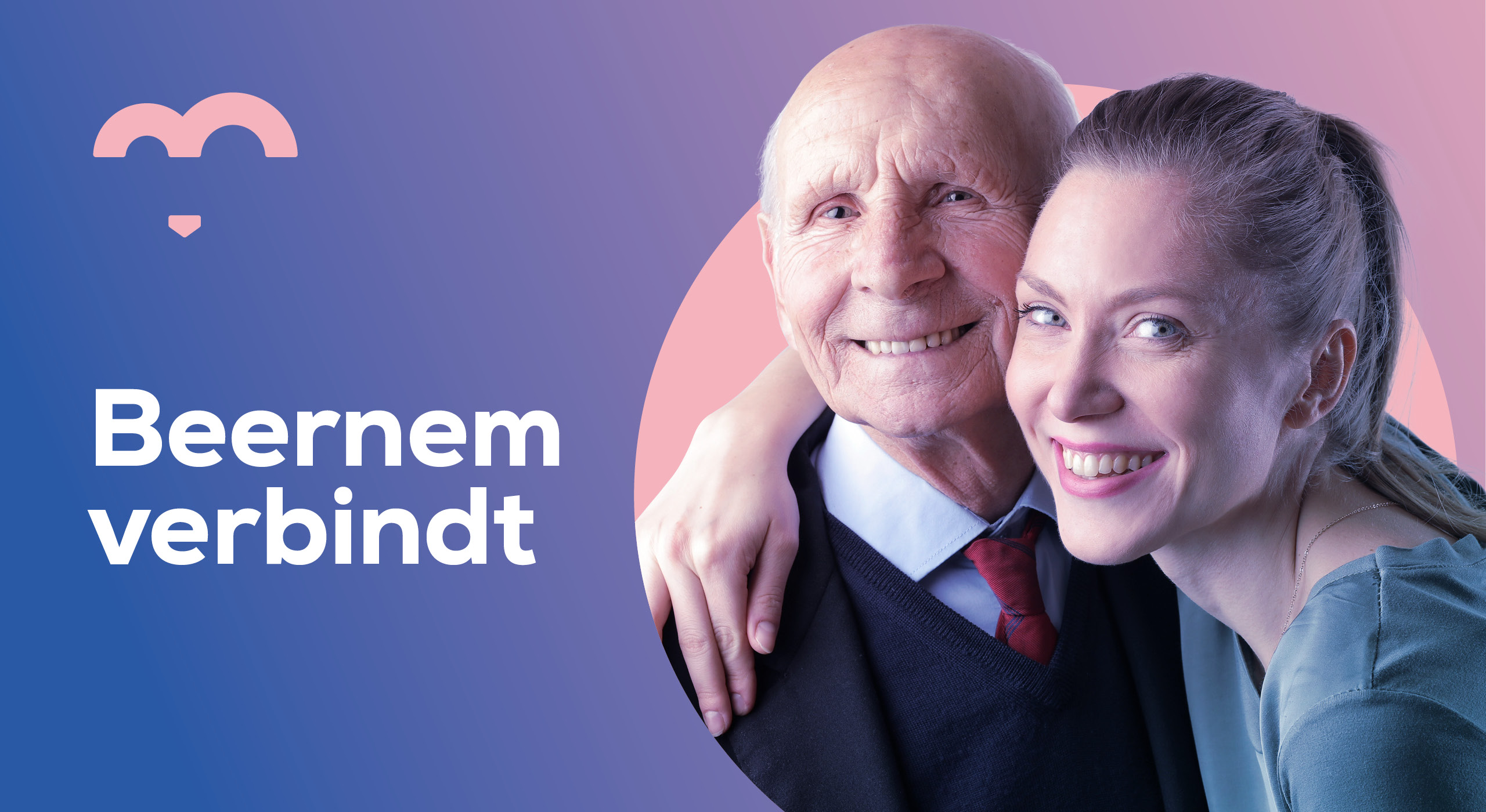
Beernem connects
Beernem is located at a crossroads of connecting roads, which creates a fragmented landscape. The municipality is crossed by the E40, the railway and the Gent-Brugge canal. There are few rural municipalities with so many bridges on their territory. The bridges not only connect the landscape, but also the people who live, work, live and experience it there.
Beernem wants to build a bridge to its inhabitants, associations, entrepreneurs … to everyone who is part of the Beernem community.